A few weeks ago Andy Andres, the director of the course, posted a neat little graphic showing all the different registrants:
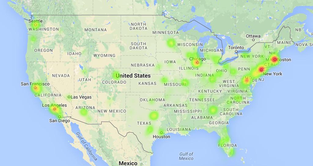 |
| Source: https://twitter.com/sabermetrics101/status/615963106632724480 |
You may notice that most of the high student density areas also happen to be high population density areas. I thought it would be more interesting to look at the map after normalizing for population. Andy was kind enough to lend me the data, so I did!
There's a link to the code at the bottom of the page, but here's the payoff:

All code can be found on my github (which, by the way, I have no idea how to use, so if I'm doing it wrong let me know).